New: advice from WCAG, Apple and Material as you edit, and Guides for everyone.
A design system for your app, without Figma or a design team.
Start from your website or a clean base. See 65 components and real pages follow every change, in light and dark, at every width. Ask for changes in words, and hear what the guidelines say before you ship. Then it's code you own, with docs, Storybook, and one command that keeps your projects in step.
- 1Start from your website, a clean base, or the tokens you have (shadcn, DTCG, Tokens Studio).
- 2Shape it live, or ask in words; every change is checked against the guidelines, with the reason and the fix.
- 3Ship it as components in your repo, with docs, Storybook, releases, and tools for your coding agent.
- Measure
- A browser opens your site and measures its colors, fonts, corners, padding, shadows and density. Reading it doesn't use an AI request.
- Build
- Four steps (foundations, components, dark mode, a page in its style), each previewed as it lands. Nothing changes until you apply it.
- Or start
- From a clean base, a screenshot of a site you like, your shadcn globals.css, or DTCG and Tokens Studio tokens.
- Changes
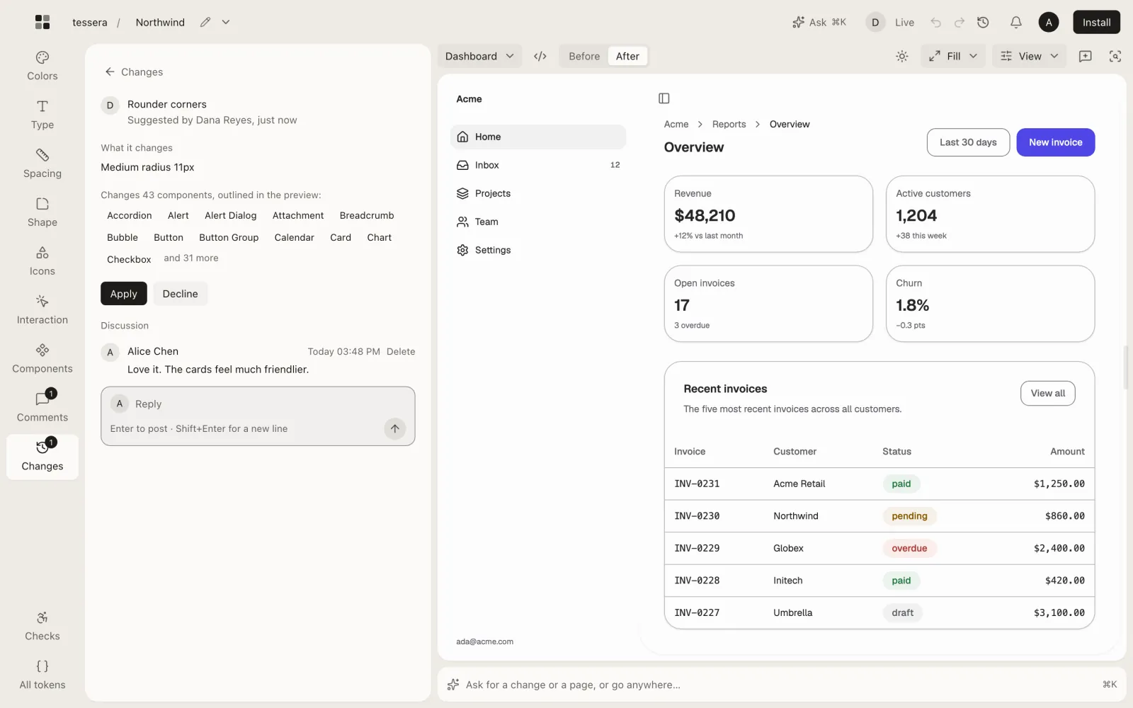
- Say it: “rounder and friendlier”, “only primary buttons are pills”, “darker borders in dark mode”. Compare before and after, with every component it reaches outlined, then apply it as one step.
- Advice
- Each change is checked against WCAG, Apple and Material: buttons too small to tap, text too small to read, sizes that stop lining up. You see the guideline, its source and the recommended way, one click away.
- Guides
- “How should I add a button size?”, “switch or checkbox?”: answered from the guidelines with your own numbers. The Guides are free to read, no AI needed.
- Pages
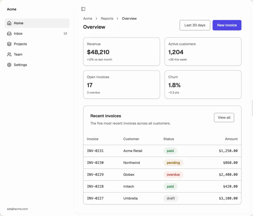
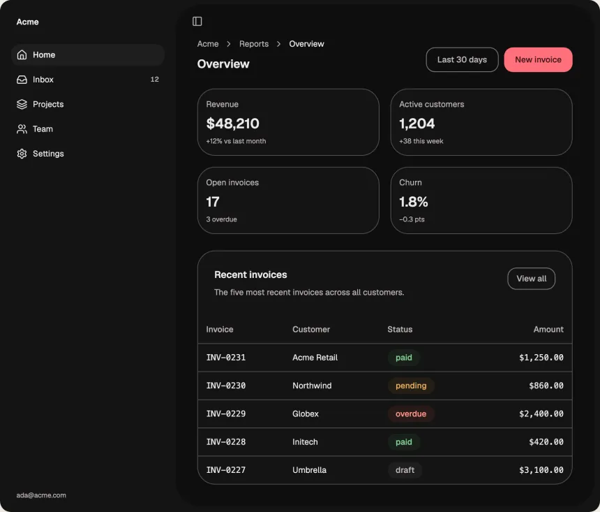
- “A pricing page”, “settings with billing”: a preview of that screen built from your components, at every width. A picture to judge the system by, not your app's code.
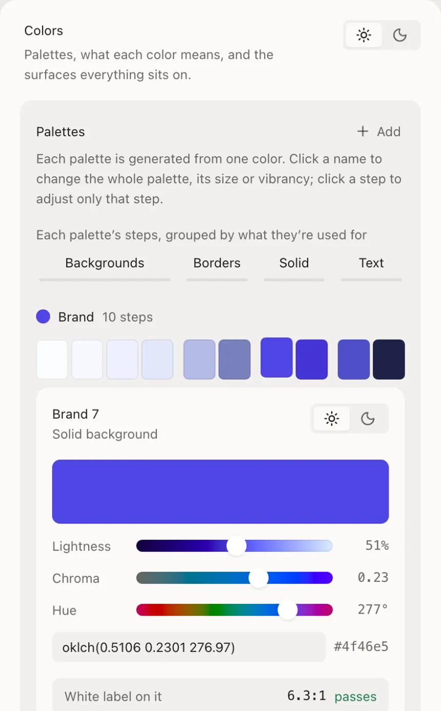
- Palettes
- Each comes from one color and stays readable in light and dark; tune its lightness, chroma, steps and vibrancy.
- Meaning
- Primary, danger, success and the rest point at palettes, so recoloring every primary button is one choice.
- Type, shape
- All of Google Fonts or your own, the type scale, spacing, corners, shadows, motion and density.
- Inspect
- Click anything in the preview to see what styles it, then change it for that one or everywhere it comes from.
- Brands
- Several brands from one system, light and dark, phone to laptop, left to right or right to left.
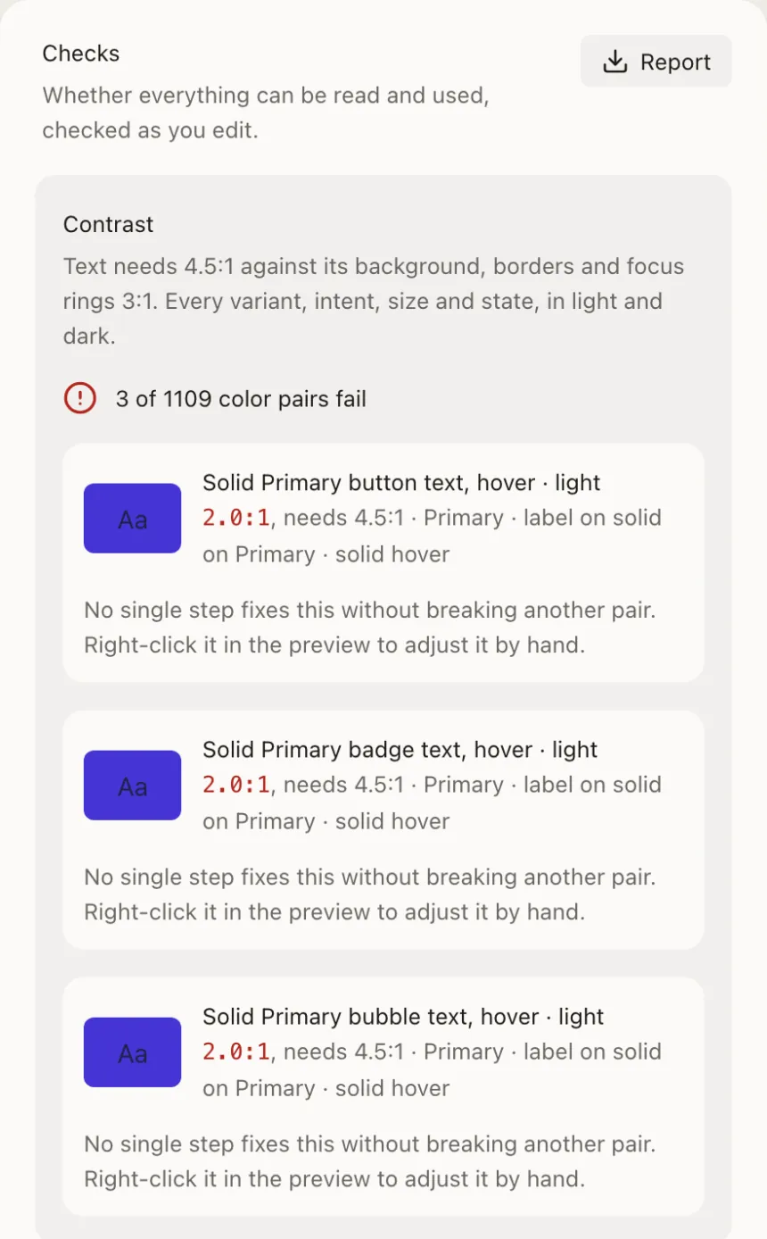
- Contrast
- Every text and border pair in every variant, size and state, in light and dark: over a thousand, checked as you edit.
- Guidelines
- Targets, text sizes, the type scale, spacing, focus rings and motion, measured on what your components render.
- Pages
- axe checks every page for labels, roles and keyboard access. Download it all as a report.
- Adoption
- npx @tesserai/cli scan scores how much of your app uses the system, and --fix replaces values that bypass it.
- Install
- One command writes the theme and every component into your repo, like shadcn/ui: React on Base UI, Radix or React Aria, and Vue and Svelte in beta. It works with shadcn-vue and shadcn-svelte too.
- Sync
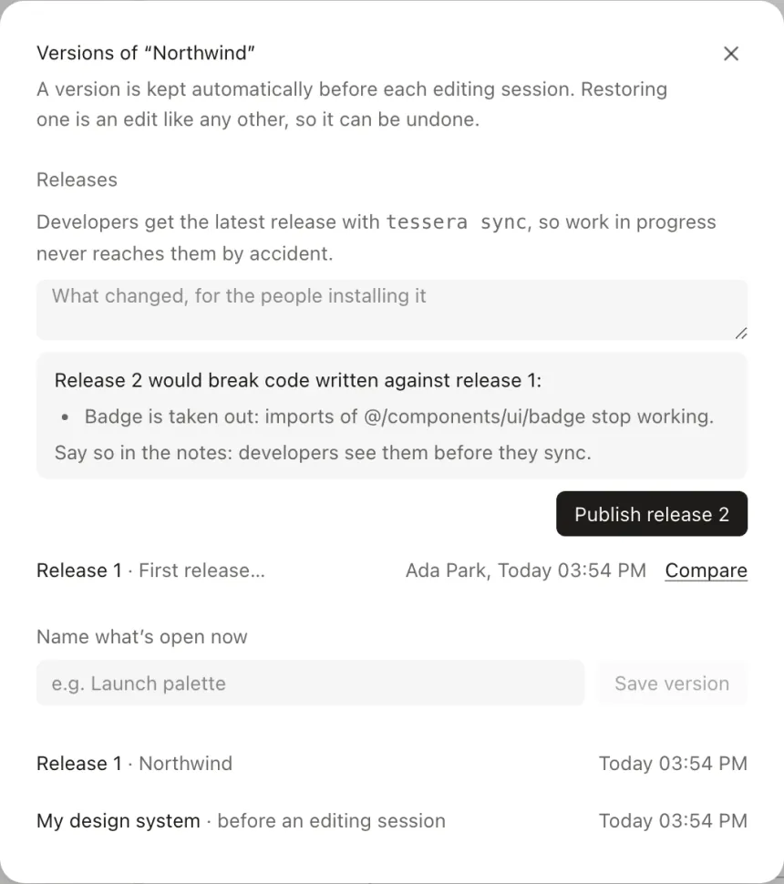
- Releases arrive with their notes and what would break; your own edits are never overwritten.
- Docs
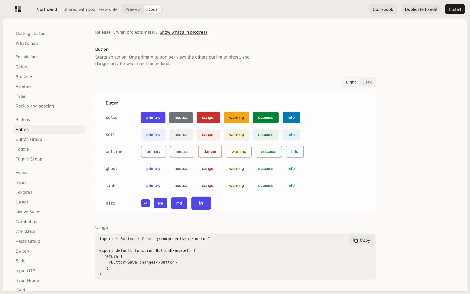
- A docs site and a hosted Storybook for every shared system, following each release.
- Agents
- Claude Code, Cursor and others get the system as MCP tools, the guidelines included, and an AGENTS.md.
- Formats
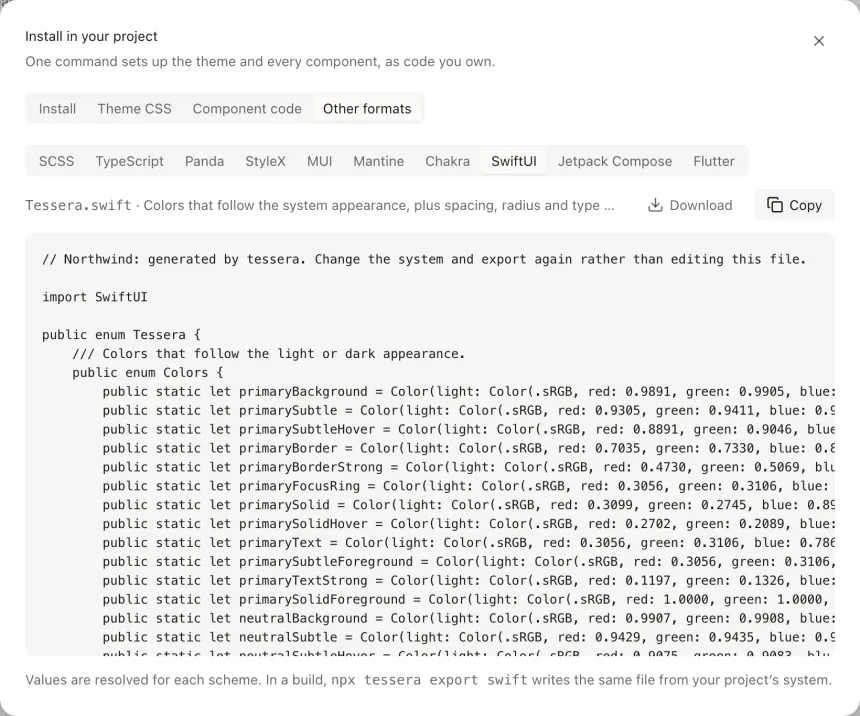
- CSS and Tailwind v4, DTCG, SCSS, TypeScript, Panda, StyleX, MUI, Mantine, Chakra, SwiftUI, Jetpack Compose, Flutter, and Figma variables (beta).
npx tesserai init https://…/s/your-system
npx tesserai sync
claude mcp add tesserai -- npx tesserai mcp
- Live
- Team systems are edited live: see who's here and where, and follow them.
- Comments
- On any component or element, with @mentions.
- Proposals
- Commenters suggest; an editor compares before and after, then applies or declines.
- Roles
- Owners, editors, commenters and viewers, and read-only links for everyone else.
Learn as you go
The Guides say what design systems have settled on (WCAG, Apple, Material), where it comes from, and how yours compares, with your own numbers. Free, no AI needed. Read the Guides
Plans
Free
$0
For trying it and for systems you keep to yourself.
- Every editing feature, in this browser or your account
- 3 systems in your account, with 30 days of versions
- AI editing to try: 20 requests a month
- Share links, a docs site and a Storybook; view and comment on systems shared with you
- Install with the command line; exports for every stack
- 3 systems in your account
Pro
Price at launch
For people who build and ship systems, alone or together.
- Everything in Free
- Unlimited systems, versions kept for good, named versions and releases
- AI editing: 1,000 requests a month, and Build from a site
- Invite people to your systems, and edit systems shared with you, live
- Unlimited systems in your account
Questions
- Your code?
- Yes. Components are written into your repo, like shadcn/ui, and nothing runs from our servers.
- Which stacks
- React with Tailwind v4, on Base UI, Radix or React Aria. Vue (Reka UI) and Svelte 5 (Bits UI) in beta, with the everyday components; the rest are on their way. Tokens for everything else, native apps included.
- Account
- Not needed: everything works in your browser. An account keeps systems across devices and lets others see them. Download every system at once, or delete your account, whenever you like.
Start with your website, or a clean base. No sign-up, and the code is yours.